It’s hard enough to get traffic to a webspace as it is, so to keep them there is doubly important.
Companies spend a small fortune on SEO and PPC, all jostling for position at the top of the Google search results. But this investment in being seen is wasted if your website offers a poor user experience – bad UX.
Imagine San Tropez investing all it’s budget on advertising and then not cleaning it’s beaches, looking after the town and having poor tourist information. Of course not, that would be inconceivable. But companies do this all the time with their web presence.
Good UX
Good UX is a combination of three basic parts, okay there are other factors, but the three fundamentals are crucial to keeping an audience.
The first is design, look good and be uncluttered. This may sound like a gimme, but it’s amazing how man corporate sites are a bit of a mess. Probably designed by committee, making that proverbial horse in a camel.
Second, the navigation
Okay, you have a gorgeous, slick website, but if you can’t find your way around or confused where to go, it’s pointless. Like a movie full of supermodels with no script or director.
And finally, and perhaps most importantly, content. Content is king. We can look great, find our way around, but if there’s nothing to see or read, your visitors will go else way. But great content is a tough nut to crack, with an increasing area of demand and supply.
Let’s go back to design
Design is something that some consider subjective. But bad design is an instant turn-off. There’s no coincidence that the world’s leading brands also have the best looking digital space. Everyone – well, almost everyone – wants to look like Apple. But very few achieve this level of excellence. Mainly because Apple have the upper hand having minimalist products, products you can lead with. But PayPal relaunched it’s website with the Apple design principle. They took their old cluttered website and simplified it. So you can be operating in an unglamorous market and look good, and you are expected to, more and more.
UX, as it’s more commonly referred to, is the glue between design and content. It’s crucial the user can navigate with ease. A good user experience should be something that’s unnoticed, a bit like writing. As the old saying goes, if it reads like writing, re-write it. UX is a complex area though, it a sum of many parts. And simplifying the customer journey is something of an art form. UX has been with us before the digital age. The London Underground map for example, the London transport system simplified. But like good design, simple can be difficult.
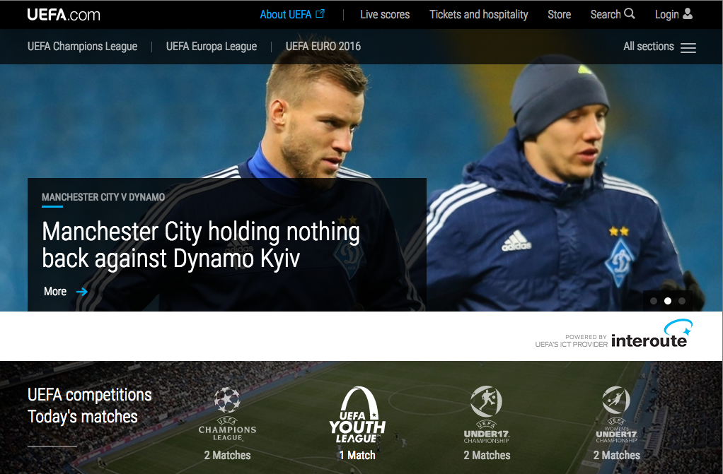
And back to content. Like I said before, content is king. Fundamentally it’s the reason for being. It’s why the user is there in the first place. The common mistake is regarding content as simply a blog page. It’s not. It’s a lot more. It’s everything that is in your site and attached to it. Let’s take UEFA – though forgetting the scandals – their website and app is content rich and engaging. It’s become more than just the home of the football organisation of Europe, it’s now the home of European football.
UEFA’s site is booked marked by hundreds of thousands of football fans. Which is impressive considering the amount of football sites and app there are out there. So, how have they achieved this? Well, with the combination of the big three – design, UX and king of the hill, content. UEFA have mastered this and understood they needed to be engaging, from the casual fan, to the devoted. Live streams, UEFA TV, club profiles and portals, tournament info, ticketing, youth development, and the list goes on. In a nutshell, everything you’ll need for sport of football and more. And it’s that phrase, ‘And more’, that’s the key.
In a ridiculously overcrowded internet world, that bit more is so important. The more accustom we are to content excellence, the more it will expected. The same goes for ease of use and design. We get used to technical advances very quickly, what was the ‘Oh my goodness’ moment soon becomes the everyday. Very much like TV, from VHS, to DVD, then Blu Ray and now ultra HD. We want more, we get more. And those who don’t deliver get left behind.
Website development
Website development is no longer just about the creation of a website. We are creating digital spaces that need to be populated, signposted, and decorated. Digital designers, producers and directors need to be in-sync with audiences and be aware of possible future trends. The need to know has never been greater, as jumping on the bandwagon usually means missing the boat.


